The Look Diary: Matching my H&M makeup to my H&M outfit
When we got a sneak peek of the full roster of H&M Beauty, I was personally curious if the quality lived up to its chic packaging. In general, the eye and lip products are great and can really compete with more established brands but what caught my eye was their set of Powder Blushers, which range from soft hues to shocking pigments. They're just P499 at select H&M branches. Naturally, I got three… because that’s what people like me do.
Anyway, the amount of makeup I’ve purchased from the Swedish fashion giant led me to reflect upon my patronage of the store and I realized that I always considered the colors of my wardrobe when deciding upon the color story of my face of the day. A lot of us are often confused with matching colors, so here I offer a simple solution: coordinate your makeup with your wardrobe to look put together, so you can pretend to know what you’re doing.
Enter: the monochromatic look.

Face: Dior Airflash in 301, NARS Radiant Creamy Concealer in Macadamia, H&M Powder Blusher in Cameo Pink; Eyes: H&M Powder Blusher in Cameo Pink, Pony Effect Conceptual Eyes Quad in #BeRomantic; Lips: Milani Amore Matte Lip Creme in Precious, NARS Velvet Lip Glide in Bound; Dress: H&M Conscious; Shoes: H&M; Coat: Forever 21; Beanie: Daiso
For nudes, play with texture
The real color of the year, the blush nude, has made its way into public consciousness and many a wardrobe in 2017, and I. Am. Here. For. It. But since it’s such a ‘tame’ color, I propose the idea of playing with textures, both in makeup and wardrobe to go from basic to bitchin’. (At least I’d like to think so.)
H&M Beauty’s Powder Blusher in Cameo Pink is this color in blush form and it’s great for accentuating the cheeks and adding shape to the face (almost like a contour). I paired this with a deeper matte mauve eye from Pony Effect (alternatively you can use mauve blushes like Dolce Vita from NARS or Florence from Pink Sugar) with Cameo Pink as the transition color. Then I added a bit of shimmer with the Anastasia Beverly Hills duochrome highlighter in Pink Heart (or Kat Von D’s Alchemist Palette, The Balm’s Cindy Lou Manizer, or Ellana’s loose pigment in Halo). I wanted to create dimension with the duochrome shimmer paired with the matte mauves using basic techniques to achieve high impact. Next, I pat on the Milani Amore Matte Lip Creme in Precious (Jordana Lip Creme in Rose Macaron can work as well!) all over my lips and added NARS Velvet Lip Glide in Bound for a bit of gloss. I wanted to tick all the textures from mattes, to shimmers, to glosses here, but kept the application light to maximize comfort.
I applied the same principle to my outfit, contrasting different textures. I chose the embroidered tulle dress from H&M Conscious as the starting point, juxtaposing its roughness with a plain slip dress, a structured but thick overcoat, velvet boots, and a wool-esque beanie to boot. The game here is to pick colors that are close enough (analogous) but vary the texture wildly to keep the interest up.
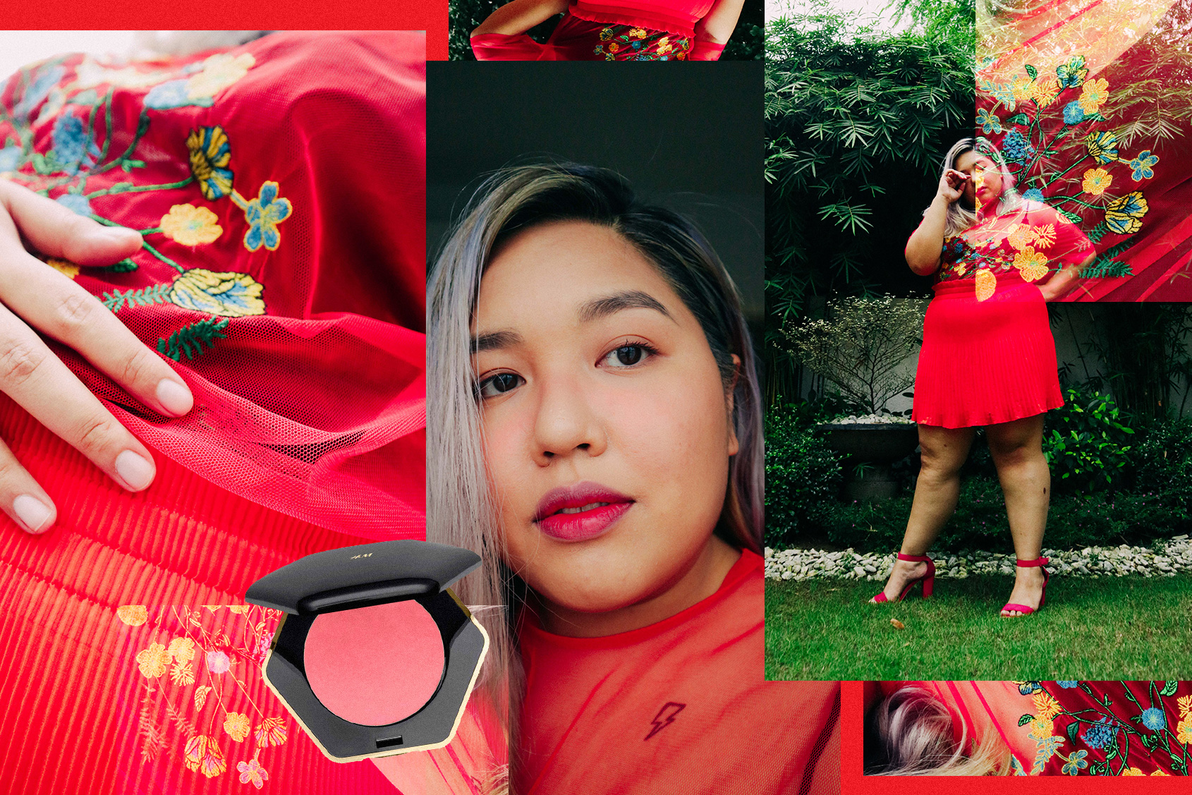
Face: Dior Airflash in 301, Yves Saint Laurent Touche Eclat in 3.5, NARS Soft Matte Complete Concealer in Ginger, H&M Beauty Powder Blusher in Imperial Red; Eyes: Blinc Tubing Amplified; Lips: Peripera Airy Ink Velvet in Elf Light Rose, Stila Stay All Day Liquid Lipstick in Beso, MAC Retro Matte Lipstick in Ruby Woo; Top: Zara; Bodysuit, Skirt, Shoes H&M
For pops of color, play with opacity
It’s very easy to go overboard with H&M’s Powder Blusher in Imperial Red, so the key is careful layering and diffusion, which we’re applying to the rest of the face and wardrobe. Note also that for H&M’s more colorful blushes, a teeny tiny amount is all that's needed for the cheeks, and it is way easier to build than take away. (The risk of clown cheeks are too real.) Imperial Red is almost too pigmented. This poppy red blush is perfect for igari (aka, the drunk blush look), with the area nearest the eyes and nose bridge having the most opaque color, and the perimeter with very diffused application.
I kept the rest of the face simple since the key to pops of color is in the editing. The lashes are just coated with mascara from Blinc, and you can add setting powder to even out the eyelid textures. For the lips I started with a diffusion of Peripera’s Airy Ink Velvet in Elf Light Rose all over the lips, then I added Stila’s Stall All Day Liquid Lipstick in Beso in the middle of the lips and pat it on with my ring finger. Next I added MAC’s Retro Matte lipstick in Ruby Woo to deepen the inner contour of the lips. (This can also be done with just one red lip tint, which I didn’t have). Lastly, I sprayed a little of my Dior Airflash foundation on a soft blending brush and traced my lip line to complete the Korean gradient.

I limited the focal points to just two things for the face, but for a different occasion, you can actually use the blush as eyeshadow and the effect is pretty cool as well! Applying the same principles of varying opacity and editing, I paired a mesh top with a pleated skirt and very simple shoes. I would’ve gone for a poppy red bodysuit as well (but had none) but the black provides a nice backdrop to the embroidery without overpowering the reds. Again we play with opacity with a see-through top, translucent (but layered with lining) bottom, and simple block shoes to find the balance between unique and edited.
How do you choose which colors to pair when you do your makeup? Does wardrobe ever factor into your decision-making process? Let’s discuss.
Photography by Charisse Reganion